Innovation
How We Built: Scenic 2.0

Peloton prides itself on providing a world-class user experience through a harmonious relationship between hardware and software. However, before this year our Scenic content, where a Member exercises by virtually traveling through a landscape, didn’t quite live up to our expectations. The video content was always too fast or too slow. The music was too generic. And finally, the user interface was borrowed from our studio classes. Everyone on the tech team felt we could do better. In April of 2021, we did better!
Separating our music and video player
The original Peloton scenic classes were not too different from normal video playback. Content editors would match up scenes from our scenic library with music from our general music library, and publish variants of these classes over time to keep it fresh. While this was a good way to have evergreen variations of scenic content, this actually led to many scenic-goers muting the volume and listening to their own music or podcasts during the ride.
When imagining Scenic 2.0, we realized this was the perfect time to introduce an entirely new way for music to interact with our scenic content. In case you haven’t experienced it yet, Scenic 2.0 supports a new format: “Distance Based Classes," which allows you to finish a class, not based on how long you’ve been in it, but based on how far you’ve gone. We also made the video more dynamic. As you increase your pedaling or running speed, we make an effort to speed up (or slow down) the video to match what you’re experiencing. This creates a powerful, and immersive experience, but there’s a catch! If we used the audio track included with the video - that too would speed up and slow down.
We got to work creating an entirely standalone music player that could play music at a consistent speed as someone runs or cycles through scenic video. This music player operates independently of the video player and its variable playback speed is governed by the member’s effort. With this new, standalone music player, we opened up a whole range of product possibilities.

The music player actually looks and functions the same across the entire platform. In a studio class, this widget just hooks into the audio cues from the video. However, in Scenic 2.0, this music widget handles all of the playback experience itself.
Tracking distance
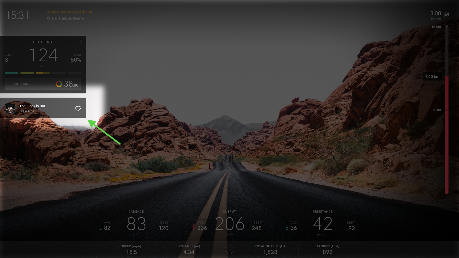
Another fascinating part of Scenic 2.0 is our new Distance Tracker. This Distance Tracker is an entirely new way to visualize your progress when taking a Peloton class. Before Scenic 2.0, the only way you could make progress in a class was tracking the time you spent in a class.

Those familiar with Peloton classes will find this “Time Based” progress tracker to be familiar across most of our experiences.
Distance seems like a no-brainer, and of course our Members want to mix up their routines with some distance based progress or possibly even train for a 5k or a 10k. While this may seem straightforward, we had a number of considerations due to Peloton’s rich feature set. In order to support Distance Based classes, we needed to reimagine (and rebuild) some of our core in class components to no longer be tied explicitly to the duration of a class. Instead, these new components are controlled by a variety of metrics, independent of a class's duration.
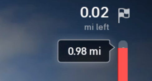
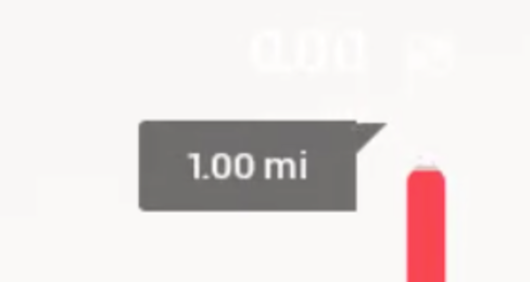
Doing this work meant we updated our internal code without changing the external behavior, which allowed us to add the Distance Progress Tracker that reads off of the same metrics system as the rest of our components, but is not explicitly tied to the duration of the video. If you look carefully at the progress tracker you’ll see several unique features. As the distance bar fills in vertically, minor distance markers disappear and major distance markers change from white to grey giving a top level view of the ride’s progress. There is a separate tooltip to the left of the bar that follows the Member’s mileage and shows the actual distance travelled. When the Member completes the ride, a separate animation in the middle of the screen expands to give the summary details.

Our distance based progress tracker is an entirely new way to track your Peloton workouts
The last pieces of Scenic we’re proud to talk about are the design details. Engineering and design came together to ensure that we created a memorable Member experience. It always seems easier to take away from design rather than add, but to elevate the look and feel of Scenic 2.0, we knew we couldn’t take the easy way out. Every animation designed, we built.
It’s not always easy figuring out how to estimate the time required to build a component like this (Figure 4), and we went through several iterations. An initial attempt at drawing this component included two shapes - a square, and a triangle, and animate them along the progress bar. However, after making much progress, we realized we did not have a good way to animate the rounding of the corners at the far ends of the progress bar in a way that made sense.


(L to R) The design team paid close attention to every detail in Scenic 2.0, and engineering worked closely with them to bring their creations to life. No scope was cut when it came to delivering a beautiful, pixel-perfect experience. The triangle animated properly, but we didn’t have a way to animate the rounding of these corners.
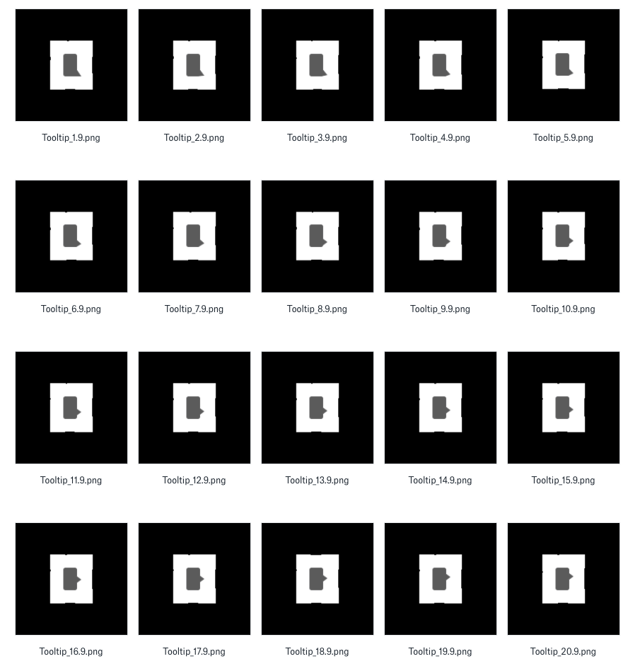
As we got closer to our Homecoming, Peloton’s annual Member event where we were announcing the feature, we had not made any progress on this problem. We had to get creative. We brainstormed and came up with two solutions. The first: brute force. We could use 36 9-patches to create every frame of this animation. It was dirty, but it would work. The second solution: draw this entirely to an android canvas, using paths. While we all agreed this was likely the optimal solution for performance and editability, no one on the scenic team had first-hand experience with these APIs. We estimated that the 9-patch solution would take a few days to implement and get right, but we couldn’t quite estimate how long the canvas solution would take. Since we didn’t have much room for error in our schedule, we opted for the 9 patch solution.

When we began to lose confidence in our “Drawing shapes” solution, we prepared a 9-patch solution as a backup.
One of our engineers stepped up to the challenge. In one day, they put together a prototype in a standalone app showing that not only could we get the canvas based solution working, it would be more performant, and more closely match the original designs. It was really incredible!
With proof-of-concept in hand, we implemented the design in the final release before Homecoming. This, along with many other examples, demonstrates why I’m proud to work at a company that takes design just as seriously as the quality of its engineering.
Growing the Content Library
We also went beyond the in-class experience to increase the number of scenic rides. We went from a single style of scenic content to three:
Time-based
Distance-based
Guided
We wanted to highlight each type of ride individually, rather than leaving them mixed in a jumble. Splitting out the library presented a challenge, and our previous approach to filtering scenic content didn't present any immediate solutions.
In the past, our scenic library had one filter: the duration of the class. We could have given clients specific parameters to filter for each type of content, but this wouldn't have been very extensible or mesh well with our architecture for other content. Instead, we decided to draw parallels between the scenic content and the divisions of our on-demand library, which is divided into "Browse Categories" based on the type of exercise, like Cycling, Strength, Yoga, Meditation. These categories are made up of one or more "Class Types" into which classes are assigned when they are created. Scenic classes were previously outside this hierarchy, and we created new browse categories and class types for each type of content and categorized classes accordingly.
While we wouldn't have a rich hierarchy of class types and wouldn’t be taking full advantage of our ability to organize content, bringing scenic classes into alignment with the rest of our content was helpful in other ways. Browse categories integrate with our ride filtering framework to provide different filters for each category. One such filter is Distance-based. This could easily generate different filters for each category and solved a second issue without requiring much additional work. By finding a way to adapt our existing architecture, we were able to not only reduce new code needed for that change, but save time integrating with other parts of the application.
Peloton’s engineering organization is at an exciting place in the lifecycle of an application. On one hand, we already have an amazing application that our Members love. On the other hand, we know we have a lot of possibilities to explore to keep the experience fresh and exciting for our Members. Maintaining this delicate balance of pushing the envelope,while preserving the essence of what made us successful in the first place, is something that I (as well as the rest of the engineering organization) am really excited to keep exploring.
If this resonates with you in any way, maybe think about checking out our careers page, and help us solve problems like these or even some we haven’t considered yet!