Innovation
Revamping Peloton Homescreen Experience with Personalized Rows
Shoya Yoshida, Shayak Banerjee, Nganba Meetei, Natalia Chen
Introduction to the Homescreen
At Peloton, there are two major avenues for Members to find their workout classes: the on-demand library and the homescreen. The on-demand library is a catalog view of all classes available on the Peloton ecosystem, and users can apply various filters and sorting or free-form text search to find classes. The homescreen, much like in other content-streaming services, is the first screen that Members see upon logging in and serves as the gateway to the Peloton experience. There, Members can scroll vertically to see various rows of content as well as horizontally within each row.
Over the last few years, the variety of our platform’s classes have grown significantly. We now boast a total of 80K+ classes, 80+ class types, 50+ instructors, and 10+ fitness disciplines. With such diversity, it can feel a bit overwhelming for users sometimes to navigate through all the offerings. In addition, each fitness discipline tends to have its own vocabulary, such as Tabata rides in cycling or HIIT in cardio workouts. Seasoned Members may be familiar with all this language and be comfortable navigating the on-demand library to find classes, but for most Members, the on-demand library presents too many choices. And even for the veteran Members, Peloton continues to release innovative content that they can explore as well. Overall, to help new users find their way around the Peloton ecosystem and to delight veteran users by helping discover new favorite types of content and everything in between, the Personalization team has been on a quest to revamp the entire homescreen experience. Up until recently, the homescreen was a mix of a few personalized modules, manually curated content and promotion banners. To ultimately reach a completely personalized homescreen, in this step in our journey, we have introduced various new personalized rows to further customize the experience for each user.
What Should be on the Homescreen Exactly?
The homescreen, being the page that all users see first every time, is one of the most important pages for the business, and consequently the homescreen must balance various goals. Broadly speaking, there are three main ones:
Help users easily find more of what they already like,
Help users explore content of adjacent interest, and
Educate users about the content and what purpose it serves towards their higher needs.
The macro-objective is for our homescreen to not only be a place where Members can reliably find classes that they already know they will like but also discover new types of classes that pique their interest. If a user takes Groove classes most of the time, the homescreen should feature a personalized list of Groove classes. Similarly, if a user likes a particular instructor, we could also recommend instructors with similar teaching styles to help them find more instructors they like. If there is a brand new type of content such as Lanebreak, the homescreen should feature this unique gamified workout experience to let the users know about a new way of working out.
Creating New Personalized Rows
All the new personalized rows we set out to create for this iteration of the homescreen aimed to satisfy the first two goals listed above. The new rows for the first goal utilizes the already-known user interests towards certain types of content to help them quickly find classes they already like. The rows for the second goal helps Members explore the vast library of content Peloton has to offer by easing them into new types of content they may not have otherwise interacted with.
Personalized Rows based on User Interest
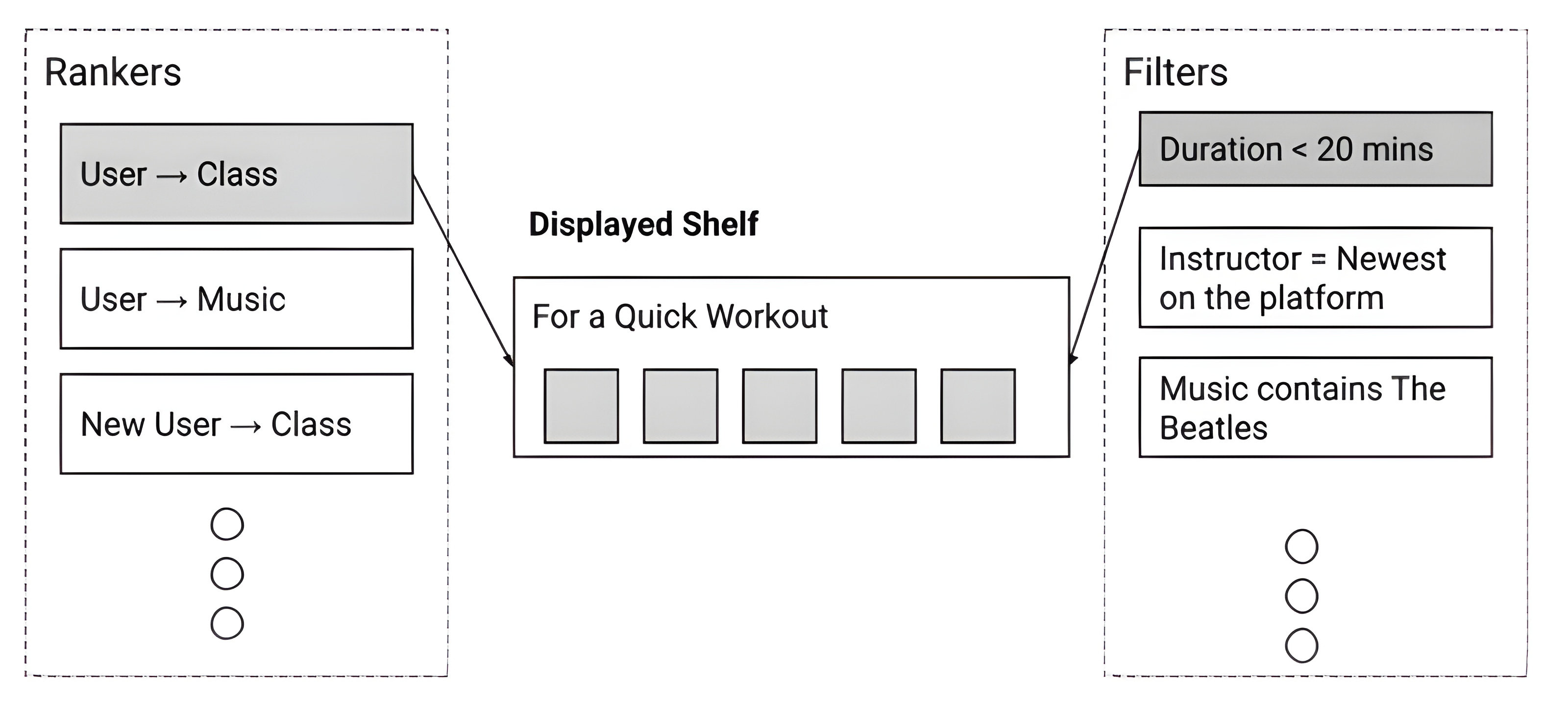
To create rows based on user interests, we decided to distill each dimension of a Member’s preference into individual rows. For Peloton Members, the most important factors for choosing a class – though they can vary depending on context – are class duration, instructor, music, and class type. Thus, in order to create new rows, we used the idea of Rankers and Filters our team previously shared in Recsys 2021. In this approach visualized below, we first use a ranker to score and rank all the classes that can be recommended to a user. From the ranked list, we apply filters to fetch a few recommendations to create a logical grouping of recommendations and serve that as a row. Since we do batch inference and precompute recommendations for a given day, using a single ranked list and multiple filters downstream is more efficient than having multiple upfront candidate generation steps followed by ranking.

Figure 1 from Personalizing Peloton: Combining Rankers and Filters To Balance Engagement and Business Goals
To demonstrate, let’s take class type based recommendations as an example. We first calculate the user's most favorite class types from recent workout history, and let’s say for one particular user, it is music-themed classes. We apply a filter to the ranked list of recommendations to fetch only music-themed classes, and then we do a weighted random sampling based on the scores by the ranker to generate the recommendations from this list. In this manner, we were able to create many rows that adhere to various dimensions of already known user preferences.
When we show the row to the users, we also make sure to provide macro and micro explanations – wherever relevant –for the recommendation to make sure it is clear to the Members why those recommendations were generated. The macro-explanations are achieved by having a descriptive, personalized title for the row such as “Because You Like Music Rides…” in the case of class type based recommendations. The micro-explanations are on an individual class level within the row, which will be used in recommendations such as artist based recommendations explained later.

An example Class Type Based Recommendations for a user
Personalized Rows for Exploration
The rows based on user interests were fairly easy to ideate and generate as the user preferred attributes are evident from the workout history, such as if a user always takes classes with particular instructors. This made filtering simple. However, to encourage exploration of other kinds of content, we need to go a step further and find out what kind of content a Member may be open to exploring given their current preferences. Here, we showcase two examples of personalized rows that encourage exploration.
Exploration through Similar Instructors
One row we wanted to create was a row to ease users to interact with instructors they have never interacted with before. This idea came up after we collaborated with our colleagues on the Product Analytics team to uncover that Members who routinely interact with multiple instructors tend to have higher engagement. As mentioned previously, at Peloton, there are over 50 instructors, each with unique teaching styles, and it’s very normal for each Member to not have taken a class with all instructors. Most Members typically gravitate to having a couple favorite instructors over time. Thus, we set out to create a new row to help users explore new instructors.
One naive way to encourage taking a new instructor is simply showing a row featuring a randomly chosen instructor that Member has never taken a class with. In this approach, users would not feel very compelled to try out the new instructor as it would typically mean investing 20-30 minutes of a planned workout time to an instructor whose teaching styles they are not familiar with without further context of the recommendation. A better way that decreases the perceived lift of taking a class with new instructors would be to recommend an instructor that is similar to the one the user already likes. It is also imperative that we communicate explicitly that we are recommending that new instructor because of the similarity. By providing this recommendation explanation, a user may be more inclined to try out a new instructor.
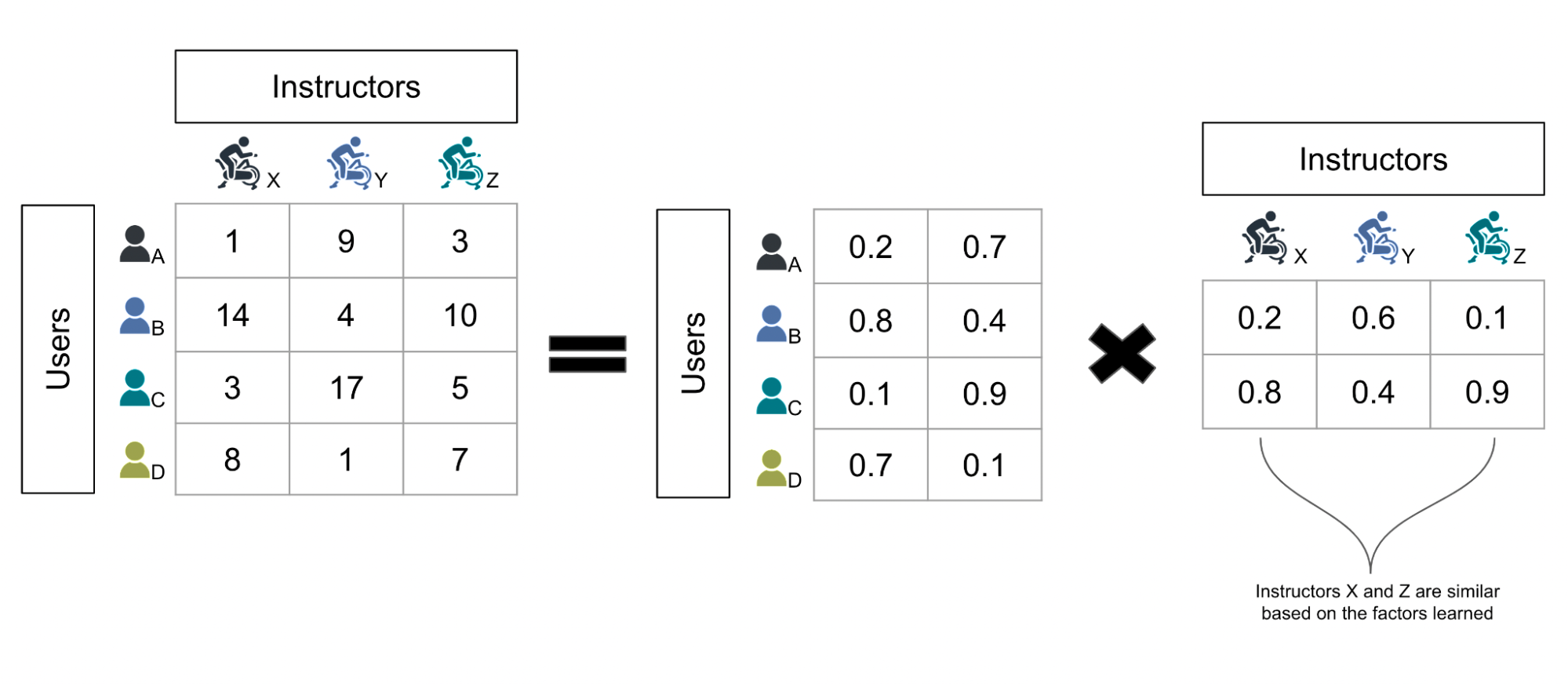
This is exactly what we did for creating this explorative instructor based recommendation. To first identify similar instructors, we took a collaborative filtering approach. We fit a simple matrix factorization model on user workout histories where the “items” are instructors and used the learned factors for each instructor to find similar instructors for each instructor. The entries of the “rating matrix” are the number of times each user has interacted with the instructor in their recent workout history. We could have also taken a heuristic-based or content-based filtering approach using metadata about the kind of classes each instructor leads, etc., but that is a bit too coarse of an approach since instructors teaching similar kinds of classes tend to be purposefully different from each other. With a collaborative filtering approach, we are able to directly capture which instructors the users think are similar and adapt to trends over time.

An illustration of applying matrix factorization to calculate similar instructors. After we calculate the factors for each instructor, we determine the similar instructors using cosine similarity. To add detail about our production system, since most instructors teach on multiple fitness disciplines, instead of simply using instructors, we actually use a cross feature of instructors and fitness disciplines for the rating matrix. This helps the model’s performance since even the same instructor has a different following for each fitness discipline they teach on (for example, the same instructor teaching cycling and yoga attracts different kinds of followers).
After calculating similar instructors, we use the Rankers and Filters approach again to filter for classes only taught by the unexplored similar instructors of the user's favorite instructors to generate the recommendations. Even though the instructors would be different from what the Members may be used to, by choosing from the recommendations with the highest scores, we still recommend classes where the other attributes of the class (i.e. class type, music, etc.) may still match the user preferences of the Member.

An example of exploratory instructor based recommendations for a user.
Exploration through your Favorite Artists
Music is core to the Peloton experience, and users can give feedback on what music they like through three main avenues:
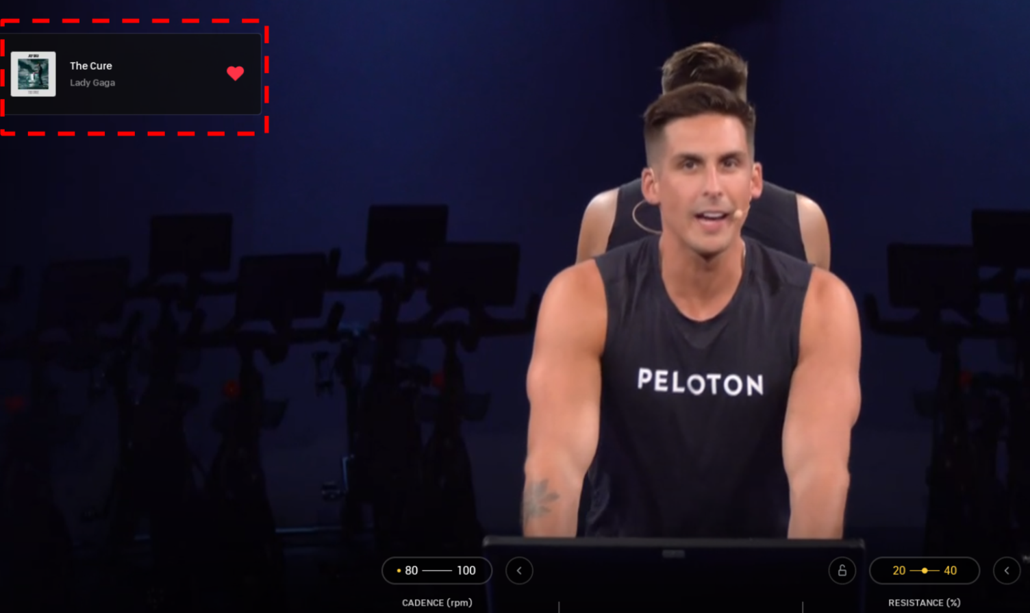
During a class, a user can explicitly “heart” a song that is currently playing (shown in the picture below)
After a class, a user can explicitly rate how the playlist was for the class
Users can implicitly tell us they like certain music if they take a music-themed class (i.e. if a user takes a whole class dedicated to one specific artist).

A user is able to “heart” a song that is currently playing in a class at the top left of the screen
Thus, we also set out to recommend classes based on a Member’s favorite music. In a similar approach to instructor based recommendations, we used collaborative filtering to learn user affinities on an artist-level. The values of the rating matrix was based on a weighted sum of feedback from the three aforementioned possible sources (i.e. if a user explicitly likes a song, that is 10 points for the specific artist. If a user doesn’t explicitly give feedback but takes a specific artist-series class, that is 1 point, etc.). After calculating the user-artist affinity scores with the model, we aggregate them for each playlist attached to a class to come up with an overall user-playlist affinity score. This score is then scaled using duration affinity and is used to generate class recommendations for the row. We purposefully don’t take into account any other user preference other than the class duration so that users may be able to find new types of classes while listening to artists they already like. We do, however, explicitly account for class duration preferences, since most of our users have a hard constraint on how long they can devote to a class.
The advantage of learning affinities at the granularity level of the artist is that we are able to exactly pinpoint a featured artist that the user likes the most in the playlist as a micro-explanation for each individual class recommendation as shown below.

An example exploratory artist based recommendations for a user. In addition to the macro-explanation (the row name of “Featuring Artists You May Like”), we also provide micro-explanations of the recommendation right below each class thumbnail (“Featuring Beyonce”) to give an idea of what the artists in the playlist of the class are like.
How We Designed the A/B Tests
As our team created new personalized rows in a weekly cadence, we needed a systematic way to run A/B tests on all of the individual rows to get an unbiased estimate of the relative value of each new row. Specifically, we want to compare the experience with and without the new row to measure the difference in engagement metrics.
Here, we lay out the plan for measuring the lift on conversion in an A/B testing framework. In order to ensure that the estimates are unbiased, we need to satisfy a few requirements:
Treatment population of users for introducing a new row should be
Randomly picked to guarantee unbiased representation and
Should have only seen the control home-screen until the start of the experiment.
This is to ensure that user actions are not biased by past intersections with other new rows. For example, a user that has already been exposed to a wide variety of new rows may respond differently than a user who sees a new row for the first time. In order to avoid this, we need each user to be in the treatment population only once during the duration of the entire series of experiments.
Similarly, control population should be
Randomly picked and
Should keep seeing the current home-screen without any new rows for the duration of the experiment.
From these requirements, we carved out N cohorts of randomly sliced user groups and the roll out looked like the chart shown below. For t=1, Group 1 becomes the treatment group and will receive the default homescreen with an additional new Row 1. It will be compared against the control Group N, which will remain as the control group for the remainder of all the experiments and not see any new rows. During t=1, all groups Group 2, 3, .. N - 1 receive the default experience like the control group as well. At t=2, the next experiment starts, and the cycle continues until we have tested all the new rows we set out to release for this iteration of the homescreen.

Every single one of the new personalized rows beat the control population in all engagement metrics tracked for the homescreen. After all the rows were individually tested as effective, we performed one more A/B test where the control group received the normal homescreen experience and the test group received a homescreen with all the new personalized rows included. In this test, the test group was able to beat the control group in homescreen conversion by a whopping 27%.
Future Work and Challenges to be Addressed
Towards a Dynamic Homescreen
Now that we have rolled out all the new personalized rows and populated the homescreen with much more rows than before, one major question arises: what should the order of the rows be? For the initial launch of all the new personalized rows, the ordering of the rows were fixed and were decided based on how well each row performed in its A/B test. There were also pre-existing rows on the homescreen, both personalized and non-personalized, and placement of those rows were decided with stakeholders.
However, a statically ordered homescreen that shows all the rows in the same exact order for every Member would not be the most optimal user experience. Some may gravitate towards class type based recommendations and as a result would want that row at the very top of the homescreen, while some may prefer to see instructor based recommendations. However, there are also additional questions. Where should promotional content go? What about rows that are meant to encourage users to explore something new but receive low engagement? Depending on various circumstances surrounding the user context (i.e. mood) and business needs, the most optimal ordering of the rows fluctuates for each individual Member. We are actively working on a Row Ranking algorithm to address these questions - stay tuned!
Which Rows Should be Generated First?
In the Ranker and Filter approach to generate rows, we sequentially generate each row one at a time. For each row, we remove the recommendations that were chosen for that row from the user’s ranked list since we don’t want different rows showing the same classes given the limited space on the homescreen. This brings us a peculiar bias where the rows that choose from the ranked list first tend to have higher quality recommendations since the classes with higher recommended scores have a higher chance of being chosen in the weighted sampling. Thus, by deciding the order in which the rows get generated, we bias some rows to be better than others in theory, which would also bias the training data into the row ranking algorithm in the future.
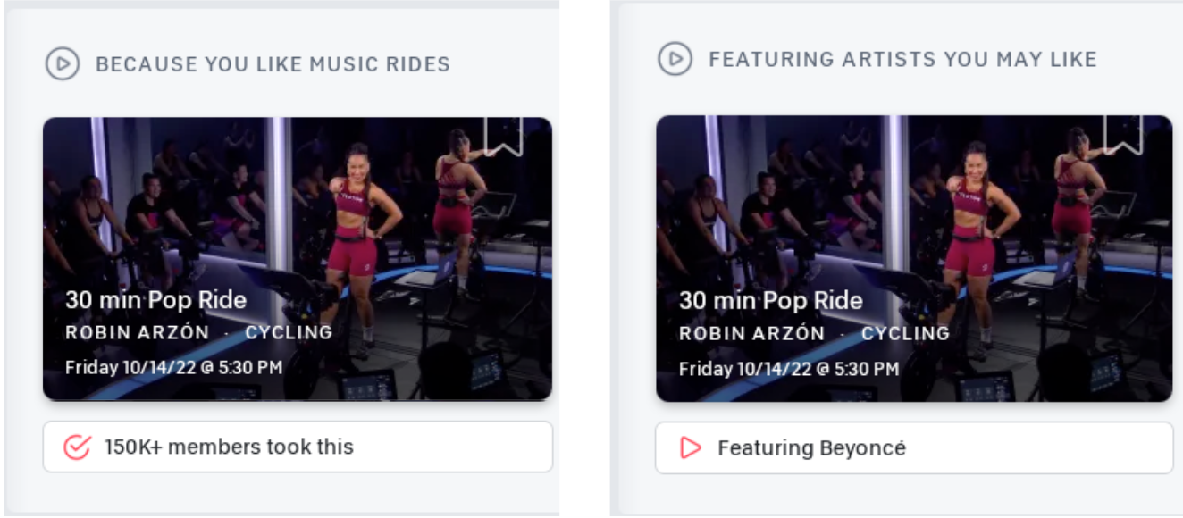
For example, let’s say a user really likes Beyonce and loves taking classes featuring her music. Let’s also assume that there is only one class featuring Beyonce in the library for now. If this class was shown in class type based recommendations, the user may not be interested because it is not immediately clear that the class has a Beyonce track (this information is available when the user taps through to scrutinize the class details). However, if we showed the class in artist based recommendations with the micro-recommendation explanation “Featuring Beyonce,” the user would very likely take it. In this case, the natural thing would be to show that class in the artist based recommendations row; however, if class type based recommendations row was generated before the artist based recommendation row, it’s possible that this class may get chosen to be shown in class type based recommendations instead.

An illustration of how even the same 30 min PoP Ride class can be shown in different ways.
There are multiple ways to address this problem, such as letting each row choose one recommendation at a time in a “round-robin” style to alleviate the problem, framing some sort of optimization problem, or training some model. We are actively looking into this challenge as well.
Enabling Rows without Engineering Effort
Today, our codebase is set up such that, in order to create a new row, an engineer just needs to write a new filter and add it to a configuration file (though it is a bit more involved if generating an exploratory row). This approach has served us well enough so far, but in a future when we may want to have an order of magnitude more number of rows, we would need to open up row creation to various teams such as Marketing and Content Creation. Our current system does not lend itself to such scaling, as engineering effort is required each time a stakeholder requests adding a new row. Sometimes, a row should only appear for some predetermined amount of time as well; if a stakeholder wants to add a new row promoting a new class type for a couple weeks, an engineer would need to write code to create the row and also remove the row after the promotion. To address these needs, we will integrate with a Row Management System that is currently being built where stakeholders and other creatives in the company will be able to easily create new rows via an UI. They would just need to specify a ranker and a filter and our system would automatically generate the row.
Conclusion
The homescreen is a powerful avenue to enrich our Member experience, and our journey to revamp this surface with the power of personalization is only getting started. We aim for a world where the homescreen continuously showcases a diverse set of recommendations pertaining to different slices of user preferences and adapting to various contexts to delightfully surprise Members every session.